The Psychology Behind Effective Branding Color Palettes
Color is more than just aesthetics; it's a powerful way to connect with your audience on a deeper level. A thoughtfully chosen branding color palette can evoke specific emotions, shape perceptions, and ultimately influence how consumers interact with your brand. Understanding the psychology of color is essential for crafting a brand identity that truly resonates.
How Colors Influence Emotions
Different colors elicit distinct emotional responses. Blue, for instance, often conveys a sense of trust and stability, making it a common choice for financial institutions. Green is frequently associated with nature, growth, and well-being, a natural fit for environmentally conscious brands. Red can create excitement and a sense of urgency, while Yellow tends to project optimism and joy. It's important to remember that these are not fixed rules; cultural nuances and individual experiences also influence how colors are perceived.
The Impact of Color on Brand Perception
Branding color palettes play a significant role in shaping consumer behavior. A compelling statistic from an Adobe survey reveals that 50% of consumers have selected one brand over another simply because of its color scheme. This trend is even more pronounced among Gen Z and millennials, with 51% reporting this behavior. This underscores the importance of color in capturing attention and influencing purchasing decisions. Consider that 54% of consumers associate blue with trust, followed by black at 44%. Strategically using colors like blue can significantly boost brand loyalty and foster consumer trust. Learn more about color psychology in branding.
Cultural and Demographic Considerations
The meaning and impact of colors can change dramatically across cultures and demographics. For example, white symbolizes purity in Western cultures, but it can represent mourning in some Eastern cultures. Color preferences can also vary between age groups and genders. Understanding your target audience is key to selecting a color palette that truly connects with them. Researching their cultural background and demographic preferences ensures your chosen colors align with their values and expectations.
Building a Cohesive Brand Identity With Color
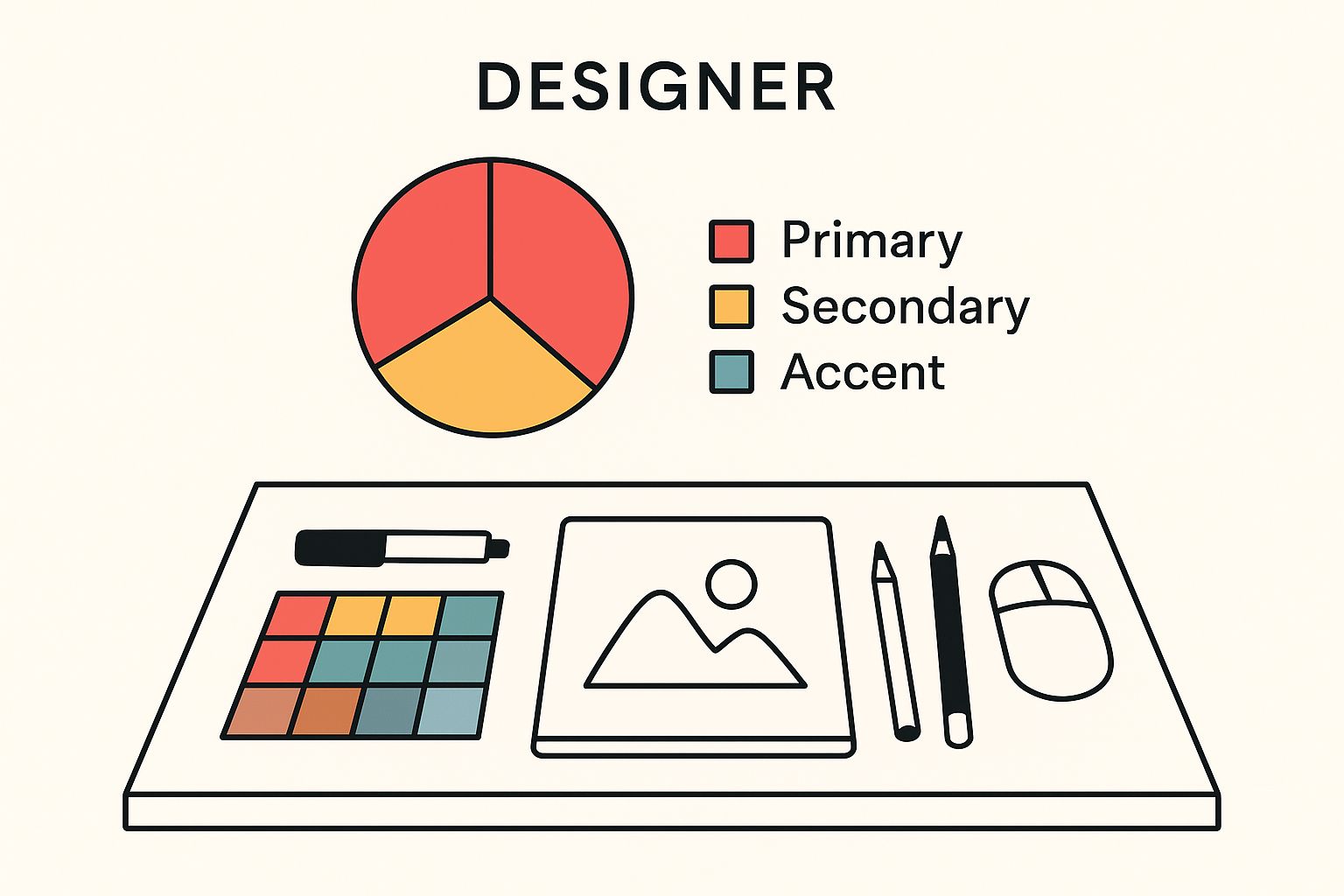
Developing an effective branding color palette is a strategic process, not just a matter of personal preference. It should reflect your brand's personality, values, and target audience. A well-defined palette typically includes a primary color representing the core of your brand, secondary colors that complement and support the primary color, and accent colors used for highlighting specific elements and adding visual interest. Carefully selecting and combining these colors creates a visual identity that is both aesthetically pleasing and strategically aligned with your brand's message, leading to a recognizable and memorable brand presence across all platforms.
Current and Emerging Branding Color Palette Trends
Building a successful brand requires a deep understanding of current and emerging trends, especially when it comes to color. Your branding color palette forms the visual foundation of your brand identity, and staying ahead of the curve can give you a real advantage. This means understanding not just which colors are trending, but also why they resonate with audiences.
Decoding the Latest Color Trends
Branding color palette trends often reflect larger cultural and technological shifts. Today, we're seeing a captivating contrast: a simultaneous draw towards both the natural and the futuristic. Earthy, organic palettes create feelings of authenticity and sustainability, appealing to a growing number of environmentally conscious consumers. At the same time, vibrant, AI-generated hues, often described as "futuristic," reflect our increasing dependence on technology and a sense of excitement about the future. This fusion of nature and technology speaks to a desire for balance in our ever-changing world.
For example, specific colors have taken center stage in branding trends in recent years. Yellow continues to be a popular option, with shades like sunny yellow, mustard, and canary used across diverse industries for their warmth and optimistic feel. In fact, 36% of consumers anticipate both futuristic tones and earthy organic palettes will play a significant role in shaping brand visual identities. These trends showcase a movement towards both futuristic and natural elements in branding, reflecting broader cultural and technological changes. Learn more about these developments at Looka.
Trending Color Palettes
Beyond individual colors, certain color palette styles are gaining popularity. Here are some of the most notable trends:
-
Monochromatic Palettes: Using shades and tints of a single color creates a sophisticated, unified look.
-
Analogous Palettes: Combining colors next to each other on the color wheel creates a harmonious and visually appealing effect.
-
Complementary Palettes: Pairing colors opposite each other on the color wheel results in a bold, high-contrast aesthetic.
-
Triadic Palettes: Using three colors evenly spaced on the color wheel gives a balanced and dynamic feel.
To illustrate these current palette styles, the data chart below compares their usage across different industries. The data chart visualizes the prevalence of different color palettes in current branding. You can see that monochromatic palettes dominate the technology sector, while analogous palettes are preferred by food and beverage brands. This chart highlights how industries use color palettes to connect with their target audiences and reinforce their brand message. The data also shows a growing trend towards triadic palettes in the fashion and design industries, indicating a shift towards more vibrant and dynamic branding in these sectors.
The following table provides further insights into the use of color in contemporary branding. It explores the emotional responses associated with different palette types and their ideal industry applications.
To better understand these palette styles, the table below provides a comparison of different color palettes.
Popular Color Palette Styles in Contemporary Branding
This table compares different color palette approaches with their emotional impact and best industry applications
| Palette Type | Emotional Response | Best Applications | Current Popularity |
|---|---|---|---|
| Monochromatic | Elegant, sophisticated, calming | Technology, luxury goods, minimalist brands | High |
| Analogous | Harmonious, natural, pleasing | Food and beverage, nature-focused brands, wellness | Medium |
| Complementary | Energetic, bold, eye-catching | Entertainment, sports, youth-oriented brands | Medium |
| Triadic | Vibrant, playful, dynamic | Fashion, design, creative agencies | Increasing |
This table highlights how choosing the right color palette can significantly impact a brand's message and connect with its target audience. While monochromatic palettes evoke sophistication, triadic palettes offer a more vibrant and dynamic feel.
Staying informed about these evolving color trends allows brands to create visually appealing and impactful identities. This knowledge helps businesses connect with their target audience and strengthen their presence in a competitive market. It's important, however, to balance trend awareness with creating a unique and timeless brand identity that goes beyond passing fads.
Crafting Your Perfect Branding Color Palette
Creating a branding color palette is much more than simply choosing your favorite colors. It's a strategic process that weaves your visual identity together with your brand's values, creating a powerful resonance with your target audience. Your color palette is the unspoken language of your brand, conveying your message before a single word is read. It sets the stage for how your brand is perceived and the emotional connection you forge with your audience.
Defining Your Brand Personality Through Color
First, clearly define your brand's personality. What feeling do you want to project? Playful and energetic? Sophisticated and elegant? Modern and minimalist? Each personality trait finds its voice through color. A vibrant, playful brand might embrace bright, contrasting colors. A sophisticated brand might opt for a more subdued, monochromatic palette. Think about how you want your audience to feel when they connect with your brand, and let those feelings guide your color choices.
Selecting Your Core Colors
Building a balanced, effective branding color palette usually involves choosing a primary color, secondary colors, and accent colors. Your primary color is the cornerstone, the most dominant color, representing the very essence of your brand. It will likely feature prominently in your logo and website. Secondary colors play a supporting role, complementing the primary color and adding visual interest. Accent colors, used strategically and sparingly, add pops of contrast and highlight key elements like call-to-action buttons.
Think of your color palette as an outfit. Your primary color is the main garment – a dress or a suit. Secondary colors are the supporting pieces, such as your shirt and shoes. Accent colors are the accessories – the jewelry, the scarf – that add those perfect finishing touches.
Achieving Color Harmony and Balance
Once you’ve selected your core colors, it's essential to ensure they harmonize. This requires considering color theory principles like hue, saturation, and value. Tools like Adobe Color and Coolors can help you generate and test different color combinations. These tools help ensure visual balance and accessibility, and allow you to explore various palette types from monochromatic to complementary or triadic combinations. The result? A cohesive and visually appealing brand aesthetic. Remember, even a trending palette will fall flat if it clashes with your brand's core message.
Practical Application and Consistency
Your branding color palette should be a constant thread woven throughout all your platforms. From your website and social media presence to your physical marketing materials, maintaining consistency is key. Define clear color specifications using RGB values for digital applications and CMYK values for print. Brand guidelines outlining the specific usage of each color ensure consistency and prevent brand dilution. Just imagine Coca-Cola suddenly switching from their iconic red! The impact on brand recognition would be drastic. Document your color codes and usage rules for a cohesive brand experience across every touchpoint.
Addressing Accessibility and Cultural Considerations
Finally, consider accessibility and cultural nuances. Ensure sufficient contrast for readability and visibility, especially for those with visual impairments. Be mindful of cultural associations. While red may signify excitement in some cultures, it holds different meanings – good luck, celebration – in others. By acknowledging these nuances, you build a branding color palette that is not only beautiful but also culturally sensitive. This inclusive approach fosters connection, trust, and ultimately, conversion, speaking to a diverse audience on a deeper level.
How Cultural Shifts Transform Color Trends
Color trends in branding are a reflection of the world around us, constantly evolving with the cultural landscape. Just like music and fashion capture the spirit of the times, so does the branding color palette. This dynamic relationship between color and culture calls for a deep understanding of the global events, technological advancements, and societal changes that shape our shared understanding of color. For instance, the increasing popularity of minimalist design has led to a rise in the use of muted and neutral colors in branding, mirroring a cultural shift toward simplicity.
The Impact of Societal Values on Color Choices
Our societal values significantly impact our color preferences and how we perceive them. The growing focus on sustainability, for example, has brought greens and earth tones to the forefront, allowing brands to visually connect with eco-conscious consumers. Similarly, the increasing emphasis on diversity and inclusivity has given rise to more vibrant and varied color palettes in branding. This demonstrates how colors can effectively communicate brand values and resonate with specific audiences, becoming powerful symbols in the process.
Technological Advancements and Color Trends
Technology also plays a key role in shaping color trends. The advent of digital media has provided designers with access to a broader spectrum of colors and the ability to create more complex color combinations. This has resulted in increased experimentation with gradients, neon shades, and other vibrant hues, particularly within the tech and entertainment industries. Further, advances in color psychology research provide valuable insights into how colors influence consumer behavior, leading to more strategic branding color palette development.
Navigating Cultural Transitions With Your Brand Colors
Adapting to these cultural shifts requires brands to evolve their color palettes while staying true to their core identity. This isn't about chasing every fleeting trend. It's about thoughtfully considering which trends genuinely align with your brand values and resonate with your target audience. The selection of branding colors often mirrors broader cultural and societal trends. For example, pink, traditionally linked with femininity, is being embraced by tech brands as a way to stand out in a competitive market. However, trend forecasts, like the Pinterest Palette for 2025, predict the emergence of colors like Cherry Red, Butter Yellow, and Aura Indigo, which are expected to influence visual identities and product lines across various sectors. This fluid nature of color trends highlights the importance of brands continually adapting their visual language to stay aligned with evolving cultural shifts and consumer preferences. Explore this topic further. Authenticity is paramount. Avoid superficial adoption of trends, as this can dilute your brand message and alienate your audience.
Case Studies of Successful Color Evolution
Many brands have successfully evolved their color palettes to reflect changing cultural values. Analyzing these case studies can provide valuable lessons in how to strategically adapt a brand's visual identity while maintaining brand recognition. Some brands have subtly updated their palettes to incorporate current trends, while others have undergone more dramatic rebrands to signal a significant shift in brand positioning. This demonstrates that color evolution can be a powerful tool for connecting with new audiences and showcasing brand growth. By understanding these cultural influences, brands can develop color palettes that are both timely and timeless, capturing the current cultural moment while remaining true to their core identity.
Implementing Your Branding Color Palette Strategically
Creating a branding color palette is just the first step. Its true power lies in its implementation across your brand's various touchpoints. Strategic implementation ensures consistency and reinforces your brand identity, making you instantly recognizable. Think of your color palette as the individual notes of your brand's melody; the implementation is the arrangement that brings it to life.
Consistency Across Platforms
Your branding color palette should unify all platforms, both digital and physical. This means consistent use of your chosen colors on your website, social media profiles, marketing materials, and even physical spaces. This consistent visual language creates a cohesive brand experience, solidifying your brand image. Imagine a symphony where each instrument plays a different tune—it would be chaotic. Similarly, inconsistent color usage creates a fragmented brand identity.
Technical Considerations for Color Accuracy
Maintaining color accuracy requires understanding color's technical aspects. RGB (Red, Green, Blue) is used for digital displays, while CMYK (Cyan, Magenta, Yellow, Key/Black) is used for print. These different color models can cause slight variations in appearance. Clearly defining your color specifications in both RGB and CMYK ensures consistent representation. This is like providing sheet music to an orchestra: everyone plays the correct notes, ensuring a harmonious performance.
Brand Guidelines for Color Usage
Develop comprehensive brand guidelines outlining each color's specific usage. Specify primary, secondary, and accent colors, and provide examples of their application. This clarity maintains color integrity and allows for creative flexibility within a defined framework. These guidelines act as the conductor’s instructions, providing structure while allowing creative expression.
To illustrate how to effectively apply your branding colors across different channels, take a look at the table below:
To help you visualize consistent color implementation, the following table outlines how to apply your brand colors across different touchpoints:
Color Palette Implementation Across Brand Touchpoints:
This table presents how to effectively apply your branding colors across different channels and materials.
| Brand Touchpoint | Primary Color Use | Secondary Color Use | Special Considerations |
|---|---|---|---|
| Website | Main background, logo, headings | Subheadings, buttons, background accents | Contrast for readability |
| Social Media | Profile picture background, post backgrounds | Text highlights, icons, graphic elements | Platform-specific image size requirements |
| Marketing Materials (Print) | Logo, main headings, key visuals | Supporting text, background elements | CMYK color values for print accuracy |
| Email Marketing | Header, footer, call-to-action buttons | Text highlights, dividing lines | Optimize for different email clients |
| Physical Space (if applicable) | Wall paint, signage, furniture | Accent décor, uniforms | Lighting conditions |
This table provides a clear framework for maintaining a consistent visual identity across your brand’s various touchpoints. Remember, consistency is key to building a strong and recognizable brand.
Adapting Your Palette to Different Mediums
While consistency is crucial, adapt your palette to different mediums. For example, adjust your website's background color for optimal readability across devices. Or, simplify your palette for smaller marketing materials. The key is maintaining your branding's core essence while making practical adjustments. This is like transposing music for different instruments: the melody stays the same, but the arrangement adapts.
By strategically implementing your branding color palette and considering technical and contextual factors, you create a strong visual identity. This consistent application builds brand recognition, fosters trust, and enhances your overall impact. It allows your brand’s message to resonate authentically with your target audience, creating a lasting impression.
Real-World Branding Color Palette Transformations
A well-crafted branding color palette is more than just a visual element; it’s a strategic asset. It can significantly impact a brand’s market position and overall success. This section explores how strategic color changes have transformed brands, providing real-world examples and actionable insights. By studying these transformations, we'll uncover the power of color in shaping brand perception, expanding audience reach, and ultimately driving business growth.

Case Study: Mastercard's Evolution
Mastercard's color evolution provides a compelling example of subtle yet effective transformation. Their original logo featured overlapping orange and yellow circles, representing the two original bankcard associations. This created a somewhat dated look, lacking impact. Over time, they simplified their logo and intensified the colors, resulting in a more modern and vibrant identity.
This streamlined design, with a stronger emphasis on the red and yellow, enhanced brand recognition. It helped solidify their position as a global leader in the payments industry.
Case Study: Spotify's Bold Green
Spotify, the music streaming giant, demonstrates the power of distinctive color. Their vibrant green has become synonymous with the brand, instantly recognizable. This color choice stands out and conveys a sense of energy and dynamism, aligning perfectly with the brand's focus on music and entertainment.
This strategic use of color has helped Spotify establish a clear visual identity. This has played a vital role in their global brand recognition.
Case Study: Airbnb's "Bélo" Transformation
Airbnb's rebranding with the "Bélo" logo demonstrates how a change in color palette can reflect a shift in brand positioning. They transitioned from a traditional blue and white color scheme to a vibrant pink and coral palette.
While initially met with mixed reactions, this new palette aimed to represent community and belonging. This bold move reflected Airbnb's evolving brand values, further solidifying their position in the hospitality industry.
Measuring The Impact of Color Palette Changes
These branding color palette transformations weren't simply aesthetic choices. They were strategic decisions backed by data. These brands tracked specific metrics to measure success, including:
- Brand Recognition: How quickly consumers identified the brand based on color.
- Engagement Metrics: How color changes impacted website clicks and social media interactions.
- Conversion Improvements: How the new palette influenced purchase decisions and sign-ups.
By analyzing these metrics, the brands quantified the impact of their color choices and demonstrated the effectiveness of their branding strategies. This data-driven approach highlights the business benefits of a well-defined branding color palette. It underscores the importance of strategic implementation.
Ready to transform your own brand with a powerful color palette? Henri Den can help. Visit henriden.com to learn more about crafting a branding color palette that converts.